
Introduction
I was unceremoniously thrust into the ‘real world’ after graduating university. One of the things I now had to deal with now was the dilemma of saving money. I wanted a financial plan that was simple. Something I would not have to frequently monitor but would still provide an above-average rate of return. I settled on mutual funds.
Because I am with RBC, I had a variety of funds to choose from. At the same time, I started learning Tableau, a powerful data visualization tool. One of the advantages to Tableau was that it was able to integrate with R, a statistical programming language I had tonnes of experience with. To simplify the decision of investing (and improve my skillset in the process), I created an interactive dashboard in Tableau.
You can view & download the dashboard here: http://bit.ly/rbcfunds
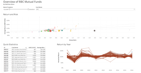
Figure 1, The interactive dashboard I created in Tableau
Technique
I searched the most common financial platforms (Quandl, Bloomberg etc.) but was not able to find a method to download the performance of a mutual fund. The biggest reason was that RBC’s mutual funds are not traded on the TSX. In the future, however, I plan on diversifying into ETFs (Exchange Traded Funds). For now, I resorted to copying and pasting data from www.rbcroyalbank.com into Excel.
Two important statistics I used to measure performance are standard deviation and Sharpe ratio. Standard deviation quantifies risk – or how much the return fluctuates around its overall average. Sharpe ratio is a bit tricky. It represents the excess return ‘rewarded’ for enduring an unit of risk, or one standard deviation.

Figure 2, The Sharpe Ratio is an important metric in designing portfolios, not just with respect to mutual funds.
Other measures I incorporated into my dashboard are AUM (Assets under management) and the fund’s date of inception.
After compiling the spreadsheet in Excel, I used Tableau to visualize the data. The hardest part here was designing the filters so that isolating one row, point, etc. will filter all other graphs. Future steps and improvements I can make is to consolidate funds from other large banks.
Bibliography
http://fundinfo.rbcgam.com/mutual-funds/rbc-funds/performance/default.fs

I would stay away from Mutual Funds. The MER on those funds are around 2%. When your portfolio reaches $500,000 you will be paying the equivalent of a new car every few years in management fees.
Have a look at ETF’s they have lower management fees and are easily bought and sold on the TSE.
LikeLike